

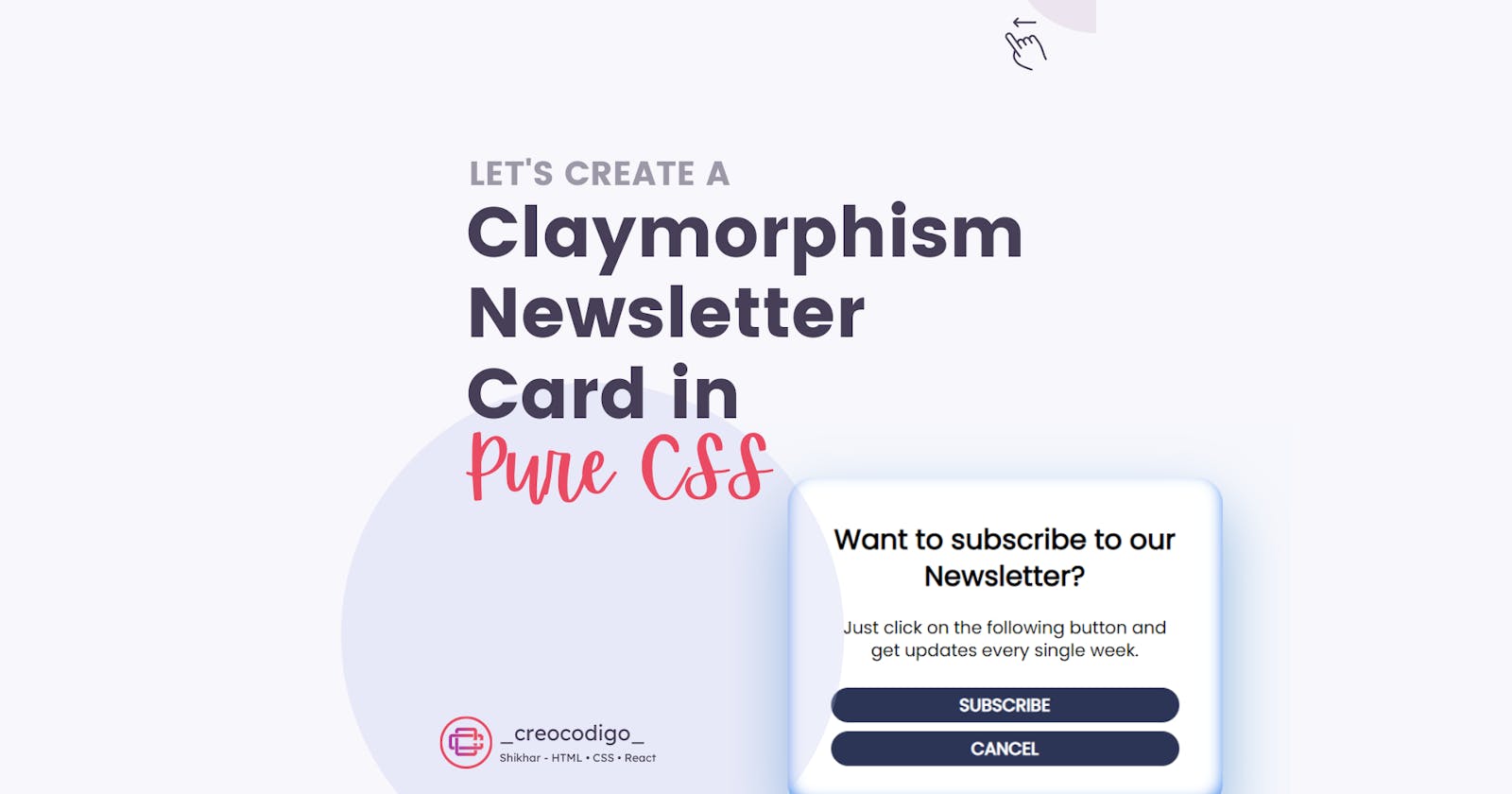


Hello Coders! Welcome to JS Project Blog. In this, we're going to see how to create a Newsletter Card with Claymorphism effect using Pure CSS. Claymorphism is becoming a trend in the UI world. Just like Glassmorphism and Neumorphism, Claymorphism is a design technique which shows your UI a 3D like Clay interface. You just have to play with box-shadow property in CSS and you can easily create this Claymorphism effect.
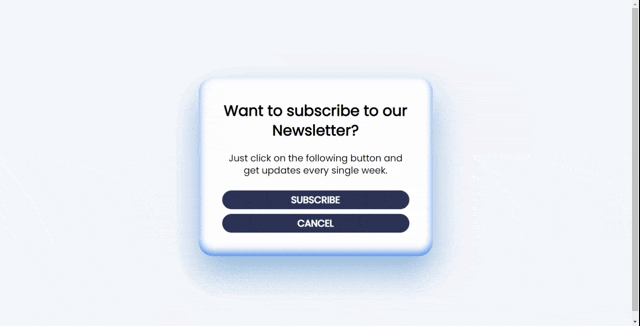
Here's a preview-
That being said, let us get started.
Step - 1: Like always, create 3 files - index.html, style.css and script.js
Step - 2: Copy the below HTML code and paste it into your code editor.
HTML
<div class="card">
     <h2 class="card-title">Want to subscribe to our Newsletter?</h2>
     <p class="card-text">Just click on the following button and get updates every single week.</p>
     <div class="card-button">Subscribe</div>
  <div class="card-button">Cancel</div>
</div>
Step - 3: Below is the CSS code for the card.
CSS
@import url('https://fonts.googleapis.com/css2?family=Poppins&display=swap');
body{
  display: flex;
  justify-content: center;
  align-items: center;
  height: 100vh;
  font-family: "Poppins";
  background: #f6f7fc;
}
.card {
    width: 400px;
    padding: 50px;
    border-radius: 30px;
    background: #ffffff;
    text-align: center;
    box-shadow: 0 35px 68px 0 rgba(0, 94, 182, 0.42), inset 0 -8px 16px 0 #4688ec;
  }
  .card-title {
    font-size: 32px;
    margin: 0  0 25px 0;
    line-height: 1.3;
    font-weight: 600;
  }
  .card-text {
    font-size: 20px;
    margin-bottom: 30px;
    line-height: 1.3;
  }
.card-button{
    font-size: 20px;
    font-weight: 900;
    margin-top: 10px;
    background: #2D3557;
    color: #ffffff;
    padding: 5px;
    border-radius: 30px;
    border: none;
    text-transform: uppercase;
    cursor: pointer;
  }
.card-button:hover{
    background: #2D3557;
    color: #ffffff;
    box-shadow: 0 17px 34px 0 rgba(0, 94, 182, 0.42), inset 0 20px 26px 0 #24477c;
  }
And that's it. You're done.
Let me know in the comments if you have any doubt related to this.
Follow @creocodigo for more projects and web related content.
If you find this useful, below are some other posts that I am sure you'll love