# Gradient Generator using Javascript
Hello Coders! Welcome to another JavaScript Blog. In this, we're going to see how generate your own gradient with pure JavaScript. This can be considered as a mini-project if you're learning JavaScript. It teaches you DOM concepts and how to change styling of CSS through JavaScript. Here's a preview -
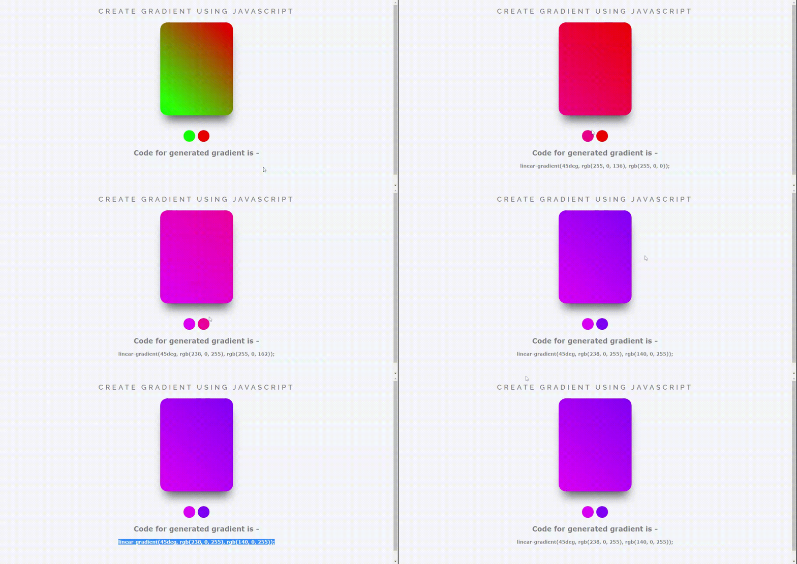
That being said, let us get started.
**Step - 1:** Like always, create 3 files - index.html, style.css and script.js.
**Step - 2: **Copy the below HTML code and paste it into your code editor.
##HTML
```
Create Gradient using Javascript
Create Gradient using Javascript
Code for generated gradient is -
```
Here we have used tag of type color to choose various colors for gradient. We have added a section for card with id=gradient to show the gradient on card.
**Step - 3: **Below is the CSS code for styling.
##CSS
```
body {
font: 'Raleway', sans-serif;
color: rgba(0,0,0,.5);
text-align: center;
font-family: Verdana, Geneva, Tahoma, sans-serif;
height: 100vh;
background-color: #f6f7fc;
}
#gradient{
position: relative;
background: linear-gradient(45deg, #00ff00 , #ff0000);
width: 250px;
height: 320px;
border-radius: 25px;
left: 50%;
transform: translateX(-50%);
margin-bottom: 50px;
box-shadow: 2px 31px 35px -15px rgba(0,0,0,0.64);
}
input{
border-radius: 50%;
height: 40px;
width: 40px;
border: none;
outline: none;
-webkit-appearance: none;
}
input::-webkit-color-swatch-wrapper {
padding: 0;
}
input::-webkit-color-swatch {
border: none;
border-radius: 50%;
}
h3 {
font: 600 1.5em 'Raleway', sans-serif;
color: rgba(0,0,0,.5);
text-align: center;
text-transform: uppercase;
letter-spacing: .3em;
width: 100%;
}
```
**Step - 4: **Below is the JavaScript code which is the most important part in this Generator. We declared some variable to store the DOM objects of a tag. We then declared a function called "setGradient()" which gets the color code from inpur tags and then assigns them to the gradient ID in HTML.
##JS
```
var css = document.querySelector("h4");
var color1 = document.querySelector(".color1");
var color2 = document.querySelector(".color2");
var gradient = document.getElementById("gradient");
function setGradient() {
gradient.style.background =
"linear-gradient(45deg, "
+ color1.value
+ ", "
+ color2.value
+ ")";
css.textContent = gradient.style.background + ";";
}
color1.addEventListener("input", setGradient);
color2.addEventListener("input", setGradient);
```
And that's it. You're done.
Let me know in the comments if you have any doubt related to this.
Follow [@creocodigo](https://www.instagram.com/_creocodigo_/) for more projects and web related content.
If you find this useful, below are some other posts that I am sure you'll love.