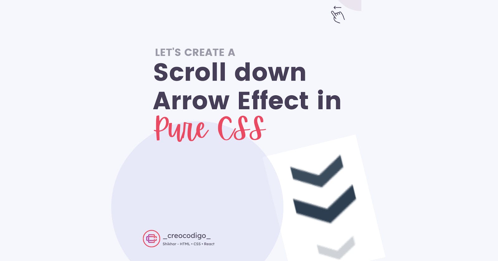
Hello Coders! Welcome to CSS Animation Blog. In this, we're going to see how to create a scroll down arrow animation in Pure CSS. This is an effect which shows user that you need to scroll down to see more content of the webpage. It's a better UI idea and catches users attention immediately so user will surely scroll.
Here's a preview-

That being said, let us get started.
Step - 1: Like always, create 2 files - index.html and style.css.
Step - 2: Copy the below HTML code and paste it into your code editor.
HTML
<!DOCTYPE html>
<html lang="en" >
<head>
  <meta charset="UTF-8">
  <title>Pure CSS Scroll Animation Arrow</title>
  <meta name="viewport" content="width=device-width, initial-scale=1">
<link rel="stylesheet" href="./style.css">

</head>
<body>

<div class="container">
  <div class="arrow"></div>
  <div class="arrow"></div>
  <div class="arrow"></div>
</div>


</body>
</html>
Step - 3: Below is the CSS code for styling.
CSS
.container {
  display: flex;
  justify-content: center;
  margin-top: 10%;
  width: 100%;
  height: 100vh;
}
.arrow {
  position: absolute;
  width: 2.1rem;
  height: 0.48rem;
  opacity: 0;
  transform: scale(0.3);
  animation: move-arrow 3s ease-out infinite;
}
.arrow:first-child {
  animation: move-arrow 3s ease-out 1s infinite;
}
.arrow:nth-child(2) {
  animation: move-arrow 3s ease-out 2s infinite;
}
.arrow:before,
.arrow:after {
  content: "";
  position: absolute;
  top: 0;
  height: 100%;
  width: 50%;
  background: #2c3e50;
}
.arrow:before {
  left: 0;
  transform: skewY(30deg);
}
.arrow:after {
  right: 0;
  width: 50%;
  transform: skewY(-30deg);
}
@keyframes move-arrow {
  25% {
    opacity: 1;
  }

  33.3% {
    opacity: 1;
    transform: translateY(2.28rem);
  }

  66.6% {
    opacity: 1;
    transform: translateY(3.12rem);
  }

  100% {
    opacity: 0;
    transform: translateY(4.8rem) scale(0.5);
  }
}
And that's it. You're done.
Let me know in the comments if you have any doubt related to this.
Follow @creocodigo for more projects and web related content.
If you find this useful, below are some other posts that I am sure you'll love
