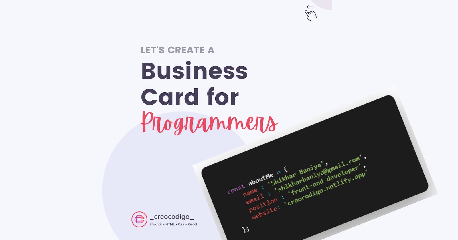


Hello Coders! Welcome to CSS Animation Blog. In this, we're going to see how to create a business card for programmers. We all need Business Card to show the work we do. So, this is a business card for all the programmers in their own way😅😍. This card looks like a code and has both front and back side. I'm sure you'll love this.
Here's a preview

That being said, let us get started.
Step - 1: Like always, create 2 files - index.html and style.css.
Step - 2: Copy the below HTML code and paste it into your code editor.
HTML
<!DOCTYPE html>
<html lang="en" >
<head>
  <meta charset="UTF-8">
  <title>Animated Business Card</title>
  <link rel="stylesheet" href="./style.css">

</head>
<body>

<div class="content">
  <div class="card">
    <div class="card__side card__side--front">
      <!-- Front Content -->
      <div class="card__cont">
        <span class="blue">alert</span>
        <span>(<span class="green">'Hello World!'</span>)</span>
      </div>
    </div>
    <div class="card__side card__side--back">
      <!-- Back Content -->
      <div class="card__cta">
        <p><span class="purple">const</span> aboutMe <span class="cyan">=</span> {
          <br />
          <span class="space red">name</span>
          <span class="cyan">:</span> <span class="green">'Shikhar Baniya'</span>,
          <br/>
          <span class="space red">email</span>
          <span class="cyan">:</span> <span class="green">'shikharbaniya@gmail.com</span>',
          <br/>
          <span class="space red">position</span>
          <span class="cyan">:</span>
          <span class="green">'front-end developer'</span>,
          <br/>
          <span class="space red">website</span><span class="cyan">:</span> <span class="green">'creocodigo.netlify.app'</span>
          <br/>
          };
        </p>
      </div>
    </div>
  </div>


</body>
</html>
Step - 3: Below is the CSS code for styling.
CSS
* {
  font-family: Consolas, "Andale Mono WT", "Andale Mono", "Lucida Console", "Lucida Sans Typewriter", "DejaVu Sans Mono", "Bitstream Vera Sans Mono", "Liberation Mono", "Nimbus Mono L", Monaco, "Courier New", Courier, monospace;
}

body {
  background-image: linear-gradient(to bottom right, #ff9800, #ffa726);
}
.blue {
  color: #29b6f6;
}
.green {
  color: #9ccc65;
}
.purple {
  color: #ba68c8;
}
.cyan {
  color: #4dd0e1;
}
.red {
  color: #ef5350;
}
.content {
  height: 100vh;
  color: white;
  display: flex;
  justify-content: center;
  align-items: center;
}
.card {
  perspective: 150rem;
  height: 20rem;
  width: 30rem;
  position: relative;
}
.card__side {
  height: 15rem;
  transition: all 0.8s ease;
  position: absolute;
  top: 0;
  left: 0;
  margin: auto;
  width: 30rem;
  backface-visibility: hidden;
  border-radius: 3px;
  overflow: hidden;
  border-radius: 15px;
  box-shadow: 0 1.5rem 4rem rgba(0, 0, 0, 0.4);
}
.card__side--front {
  background-color: #1c1c1c;
}
.card__side--back {
  transform: rotateY(180deg);
  background-color: #1c1c1c;
}
.card:hover .card__side--front {
  transform: rotateY(-180deg);
}
.card:hover .card__side--back {
  transform: rotateY(0deg);
}
.card__cont {
  height: 15rem;
  background-color: #1c1c1c;
  display: flex;
  align-items: center;
  justify-content: center;
}
.card__cta {
  position: absolute;
  top: 50%;
  left: 50%;
  transform: translate(-50%, -50%);
  width: 90%;
  color: white;
}
.card__cta p {
  margin-left: 1rem;
}
.card__cta p > .space {
  margin-left: 2rem;
}
And that's it. You're done.
Let me know in the comments if you have any doubt related to this.
Follow @creocodigo for more projects and web related content.
If you find this useful, below are some other posts that I am sure you'll love