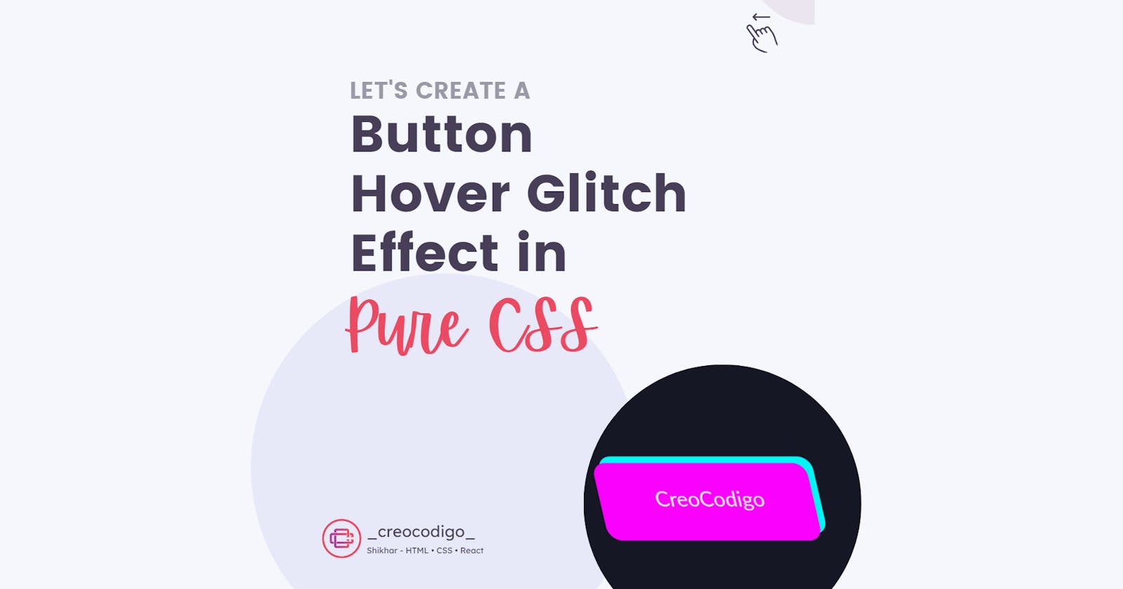
Hello Coders! Welcome to CSS Animation Blog. In this, we're going to see how to create an amazing and cool Glitch Effect on Button Hover in Pure CSS. This is a unique fun animation which when you hover over a button, you can see a glitch effect happening. This allows you to spread your fingers and try to create something cool using CSS Animations. You will learn about skew animation as well which is nothing but to tilt something along X or Y axis. Hope you'll like this animation.
Here's a preview-

That being said, let us get started.
Step - 1: Like always, create 2 files - index.html and style.css.
Step - 2: Copy the below HTML code and paste it into your code editor.
HTML
<html lang="en">
<head>
    <meta charset="UTF-8">
    <meta http-equiv="X-UA-Compatible" content="IE=edge">
    <meta name="viewport" content="width=device-width, initial-scale=1.0">
    <link rel="stylesheet" href="style.css">
    <title>Glitch Button Effect</title>
</head>
<body>
    <div class="glitch">
        <a href="#">CreoCodigo</a>
    </div>
</body>
</html>
Step - 3: Below is the CSS code for styling.
CSS
html {
    font-size: 62.5%;
    background: #161724;
    overflow: hidden;
    font-family: lato;
}
.glitch {
    width: 70%;
    min-height: 60vh;
    position: absolute;
    left: 50%;
    top: 50%;
    transform: translate(-50%, -50%);
    display: flex;
    align-items: center;
    justify-content: center;
    font-size: 2rem;
}
a {
    text-decoration: none;
    color: #efefef;
    background: #161724;
    padding: 2.5rem 5rem;
    border-radius: 1.3rem;
    position: relative;
}
a:hover {
    animation: skew .4s;
}
a::after {
    content: "";
    display: block;
    width: 100%;
    height: 100%;
    position: absolute;
    background: #fa01fd;
    left: 0;
    bottom: 0;
    z-index: -1;
    border-radius: 1.3rem;
    color: #efefef;
}
a::before {
    content: "";
    display: block;
    width: 100%;
    height: 100%;
    position: absolute;
    background: #00f7f6;
    left: 0;
    top: 0;
    z-index: -1;
    border-radius: 1.3rem;
}
a:hover::after {
    animation: pink .4s 2;
}
a:hover::before {
    animation: blue .4s 2;
}

@keyframes blue {
    0% { transform: translate(0) }
    20% { transform: translate(-.6rem, .6rem) }
    40% { transform: translate(-.6rem, -.6rem) }
    60% { transform: translate(.6rem, -.6rem) }
    80% { transform: translate(.6rem, -.6rem) }
    to { transform: translate(0) }
}

@keyframes pink {
    0% { transform: translate(0) }
    20% { transform: translate(.6rem, .6rem)}
    40% { transform: translate(.6rem, .6rem) }
    60% { transform: translate(-.6rem, -.6rem) }
    80% { transform: translate(-.6rem, .6rem) }
    to { transform: translate(0) }
}

@keyframes skew {
    0% { transform: skew(0);}
    20% { transform: skew(-50deg); }
    40% { transform: skew(10deg); }
    60% { transform: skew(-20deg); }
    80% { transform: skew(25deg); }
    to { transform: skew(0); }
}
And that's it. You're done.
Let me know in the comments if you have any doubt related to this.
Follow @creocodigo for more projects and web related content.
If you find this useful, below are some other posts that I am sure you'll love
