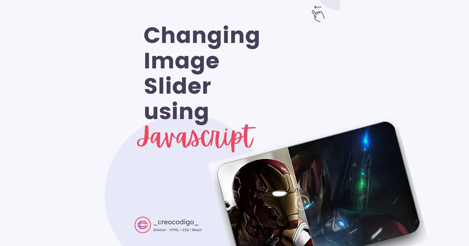


Hello Coders! Welcome to JavaScript Animation Blog. In this, we are going to create a slider which when slides in any direction, you can see the image changing. It will be like a sliding window, you see an image when you open, and another image when you close. It's a fun project which I created when I was bored😅. It refreshes your basics and allows you to imaging further. SInce I am an IronMan Fan, hence the photos😎😎. Enjoy Reading!!
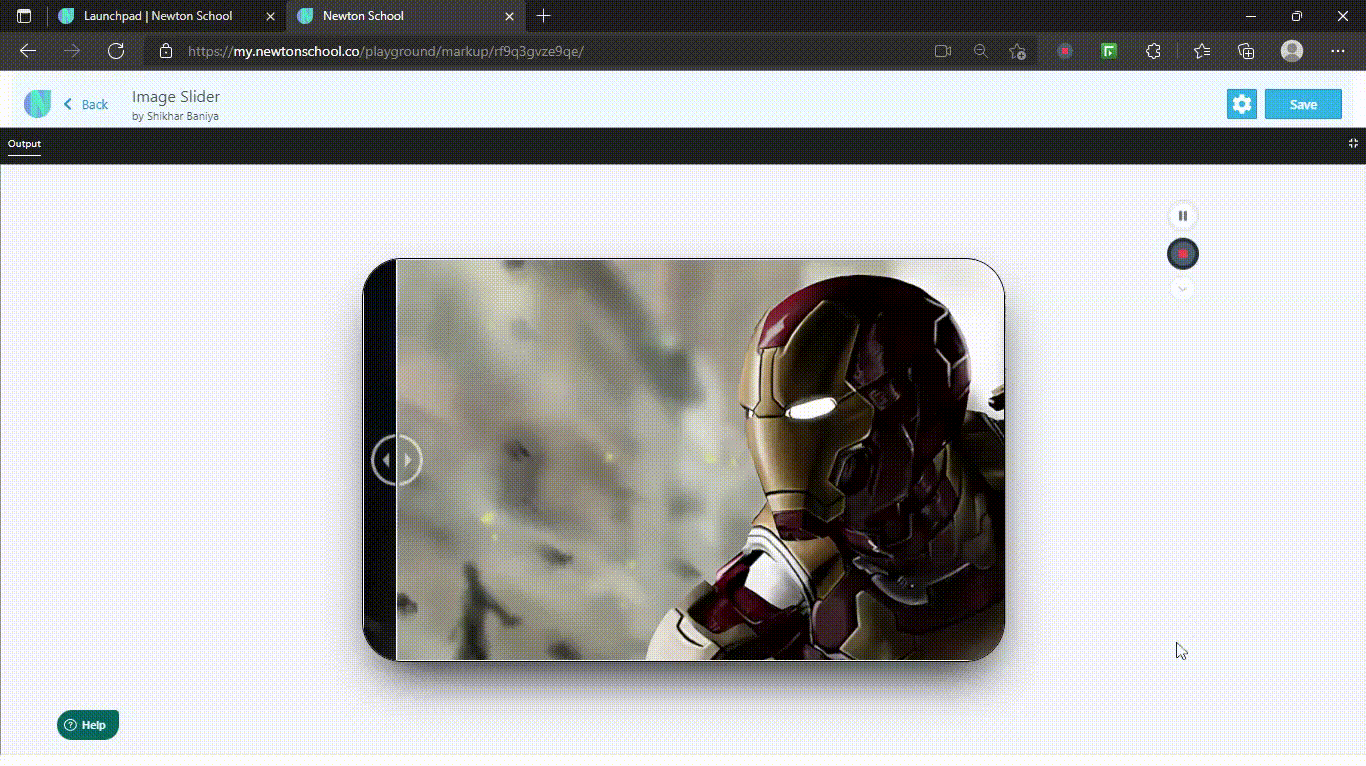
Here's a preview-
That being said, let us get started.
Step - 1: Like always, create 3 files - index.html , style.css and script.js.
Step - 2: Copy the below HTML code and paste it into your code editor.
HTML
<!DOCTYPE html>
<html lang="en">
<head>
  <meta charset="UTF-8">
  <meta name="viewport" content="width=device-width, initial-scale=1.0">
  <meta http-equiv="X-UA-Compatible" content="ie=edge">
  <title>Changing Image Slider</title>
</head>
<body>
    <div class="container">
      <figure>
        <div id="change"></div>
      </figure>
      <input onchange="change()" oninput="change()" type="range" min="0" max="100" value="50" id="slider">
    </div>
</body>
</html>
Step - 3: Below is the CSS code for styling.
CSS
body{
    margin: 0;
    background: #f6f7fc;
    display: flex;
    justify-content: center;
    align-items: center;
    height: 100vh;
}
.container{
    height: 500px;
    width: 800px;
    border: 2px solid #000;
    border-radius: 50px;
    box-shadow: 2px 32px 66px -21px;
    overflow: hidden;
    margin: 1vw auto;
}
.container figure{
    background-image: url(https://www.teahub.io/photos/full/195-1953169_iron-man-4k-wallpaper-for-pc.jpg);
    width: 100%;
    height: 500px;
    background-size: cover;
    margin: 0;
    position: relative;
}
#change{
    background-image: url(https://free4kwallpapers.com/uploads/originals/2019/04/29/iron-man-avengers-endgame--wallpaper.jpg);
    height: 500px;
    background-size: cover;
    bottom: 0;
    border-right: 2px solid #fff;
    width: 50%;
    max-width: 98.6%;
    min-width: 0.6%;
    overflow: visible;
    position: absolute;
}
input#slider{
    margin: 0;
    left: 0;
    top: -100vw;
    padding: 0;
    width: 100%;
    height: 100vw;
    position: relative;
    cursor: col-resize;
    border: none;
    outline: none;
}
#change::before{
    content: '';
    background: url(https://1.bp.blogspot.com/-z3TgKzTLWkk/YQLrjCDOqzI/AAAAAAAACYc/6aV8ZCzTjSAC7a-TOdSfXqTtRbG2A0qCwCNcBGAsYHQ/s0/comparision.png) no-repeat center;
    width: 65px;
    height: 100%;
    background-size: contain;
    float: right;
    margin-right: -34px;
    top: 0;
    position: relative;
}
Step - 4: Below is the JS code for the functionality. It's very easy to understand and I'm sure you'll understand the concept.
JS
function change(){
    document.getElementById("change").style.width =
        document.getElementById("slider").value + "%";
}
And that's it. You're done.
Let me know in the comments if you have any doubt related to this.
Want to see detailed Explanation Video, Here you go - youtube.com/channel/UCIF8DTN11VIPtkwNlgEUrIA
Follow @creocodigo for more projects and web related content.
If you find this useful, below are some other posts that I am sure you'll love