Custom Product Card using JavaScript

Hello Coders! Welcome to JS Project Blog. In this, we're going to see how to create a Custom Product Card using JavaScript and jQuery. Product Cards are most important in any E-Commerce websites. It highlights your product, allows users to see all the details about the product on the same card and its better UI. Here's one example of the product card with some unique animations. Hope you'll like it.
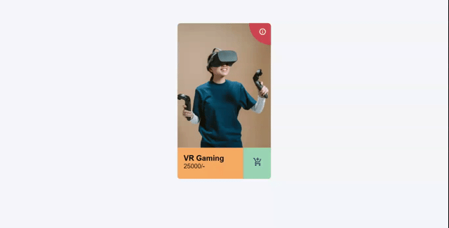
Here's a preview-
That being said, let us get started.
Step - 1: Like always, create 3 files - index.html, style.css and script.js
Step - 2: Copy the below HTML code and paste it into your code editor.
HTML
<!DOCTYPE html>
<html lang="en" >
<head>
  <meta charset="UTF-8">
  <title>Product card</title>
  <link href="https://fonts.googleapis.com/icon?family=Material+Icons"
      rel="stylesheet"><link rel="stylesheet" href="./style.css">

</head>
<body>

<div class="wrapper">
  <div class="container">
    <div class="top"></div>
    <div class="bottom">
      <div class="left">
        <div class="details">
          <h1>VR Gaming</h1>
          <p style="font-size: 20px;">25000/-</p>
        </div>
        <div class="buy"><i class="material-icons">add_shopping_cart</i></div>
      </div>
      <div class="right">
        <div class="done"><i class="material-icons">done</i></div>
        <div class="details">
          <h1 style="font-size: 20px;">VR Gaming</h1>
          <p >Added to your cart</p>
        </div>
        <div class="remove"><i class="material-icons">clear</i></div>
      </div>
    </div>
  </div>
  <div class="inside">
    <div class="icon"><i class="material-icons">info_outline</i></div>
    <div class="contents">
      <table>
        <tr>
          <th>Width</th>
          <th>Height</th>
        </tr>
        <tr>
          <td>3000mm</td>
          <td>4000mm</td>
        </tr>
        <tr>
          <th>Something</th>
          <th>Something</th>
        </tr>
        <tr>
          <td>200mm</td>
          <td>200mm</td>
        </tr>
        <tr>
          <th>Something</th>
          <th>Something</th>
        </tr>
        <tr>
          <td>200mm</td>
          <td>200mm</td>
        </tr>
        <tr>
          <th>Something</th>
          <th>Something</th>
        </tr>
        <tr>
          <td>200mm</td>
          <td>200mm</td>
        </tr>
      </table>
    </div>
  </div>
</div>

  <script src='https://code.jquery.com/jquery-2.2.4.min.js'></script><script  src="./script.js"></script>

</body>
</html>
Step - 3: Below is the CSS code for styling.
CSS
html, body {
  background: #f6f7fc;
  font-family: sans-serif;
  padding: 25px;
}

.wrapper {
  width: 300px;
  height: 500px;
  background: white;
  margin: auto;
  position: relative;
  overflow: hidden;
  border-radius: 10px 10px 10px 10px;
  box-shadow: 0;
  transform: scale(0.95);
  transition: box-shadow 0.5s, transform 0.5s;
}
.wrapper:hover {
  transform: scale(1);
  box-shadow: 5px 20px 30px rgba(0, 0, 0, 0.2);
}
.wrapper .container {
  width: 100%;
  height: 100%;
}
.wrapper .container .top {
  height: 80%;
  width: 100%;
  background: url(https://image.freepik.com/free-photo/medium-shot-man-trying-futuristic-device_23-2148864992.jpg) no-repeat center center;
  background-size: 100%;
}
.wrapper .container .bottom {
  width: 200%;
  height: 20%;
  transition: transform 0.5s;
}
.wrapper .container .bottom.clicked {
  transform: translateX(-50%);
}
.wrapper .container .bottom h1 {
  margin: 0;
  padding: 0;
}
.wrapper .container .bottom p {
  margin: 0;
  padding: 0;
}
.wrapper .container .bottom .left {
  height: 100%;
  width: 50%;
  background: #FFAD60;
  position: relative;
  float: left;
}
.wrapper .container .bottom .left .details {
  padding: 20px;
  float: left;
  width: calc(70% - 40px);
}
.wrapper .container .bottom .left .details h1{
  font-size: 1.5em;
  font-weight: bold;
  margin: 0;
  padding: 0;
}
.wrapper .container .bottom .left .buy {
  float: right;
  width: calc(30% - 2px);
  height: 100%;
  background: #96CEB4;
  transition: background 0.5s;
  border-left: solid thin rgba(0, 0, 0, 0.1);
}
.wrapper .container .bottom .left .buy i {
  font-size: 30px;
  padding: 30px;
  color: #254053;
  transition: transform 0.5s;
}
.wrapper .container .bottom .left .buy:hover {
  background: #A6CDDE;
}
.wrapper .container .bottom .left .buy:hover i {
  transform: translateY(5px);
  color: #00394B;
}
.wrapper .container .bottom .right {
  width: 50%;
  background: #A6CDDE;
  color: white;
  float: right;
  height: 200%;
  overflow: hidden;
}
.wrapper .container .bottom .right .details {
  padding: 20px;
  float: right;
  width: calc(70% - 40px);
}
.wrapper .container .bottom .right .done {
  width: calc(30% - 2px);
  float: left;
  transition: transform 0.5s;
  border-right: solid thin rgba(255, 255, 255, 0.3);
  height: 50%;
}
.wrapper .container .bottom .right .done i {
  font-size: 30px;
  padding: 30px;
  color: white;
}
.wrapper .container .bottom .right .remove {
  width: calc(30% - 1px);
  clear: both;
  border-right: solid thin rgba(255, 255, 255, 0.3);
  height: 50%;
  background: #BC3B59;
  transition: transform 0.5s, background 0.5s;
}
.wrapper .container .bottom .right .remove:hover {
  background: #9B2847;
}
.wrapper .container .bottom .right .remove:hover i {
  transform: translateY(5px);
}
.wrapper .container .bottom .right .remove i {
  transition: transform 0.5s;
  font-size: 30px;
  padding: 30px;
  color: white;
}
.wrapper .container .bottom .right:hover .remove, .wrapper .container .bottom .right:hover .done {
  transform: translateY(-100%);
}
.wrapper .inside {
  z-index: 9;
  background: #D9534F;
  width: 140px;
  height: 140px;
  position: absolute;
  top: -70px;
  right: -70px;
  border-radius: 0px 0px 200px 200px;
  transition: all 0.5s, border-radius 2s, top 1s;
  overflow: hidden;
}
.wrapper .inside .icon {
  position: absolute;
  right: 85px;
  top: 85px;
  color: white;
  opacity: 1;
}
.wrapper .inside:hover {
  width: 100%;
  right: 0;
  top: 0;
  border-radius: 0;
  height: 80%;
}
.wrapper .inside:hover .icon {
  opacity: 0;
  right: 15px;
  top: 15px;
}
.wrapper .inside:hover .contents {
  opacity: 1;
  transform: scale(1);
  transform: translateY(0);
}
.wrapper .inside .contents {
  padding: 5%;
  opacity: 0;
  transform: scale(0.5);
  transform: translateY(-200%);
  transition: opacity 0.2s, transform 0.8s;
}
.wrapper .inside .contents table {
  text-align: left;
  width: 100%;
}
.wrapper .inside .contents h1, .wrapper .inside .contents p, .wrapper .inside .contents table {
  color: white;
}
.wrapper .inside .contents p {
  font-size: 13px;
}
Step - 3: Below is the jQuery code for adding and removing the class.
JS
$('.buy').click(function(){
  $('.bottom').addClass("clicked");
});

$('.remove').click(function(){
  $('.bottom').removeClass("clicked");
});
And that's it. You're done.
Let me know in the comments if you have any doubt related to this.
Follow @creocodigo for more projects and web related content.
If you find this useful, below are some other posts that I am sure you'll love


