

Hello Coders! Welcome to CSS Animation Blog. In this, we're going to see how to create an accordian using pure CSS. This is the component which you can see in almost every service or product website - FAQ Section. It shows frequently asked questions to the user so that user will have no doubt about the service or the product. In this accordian, users first will see the question and if they want to know the answer of that, they just have to click it. It's the most reliable User Experience from user's as well as developer's point of view.
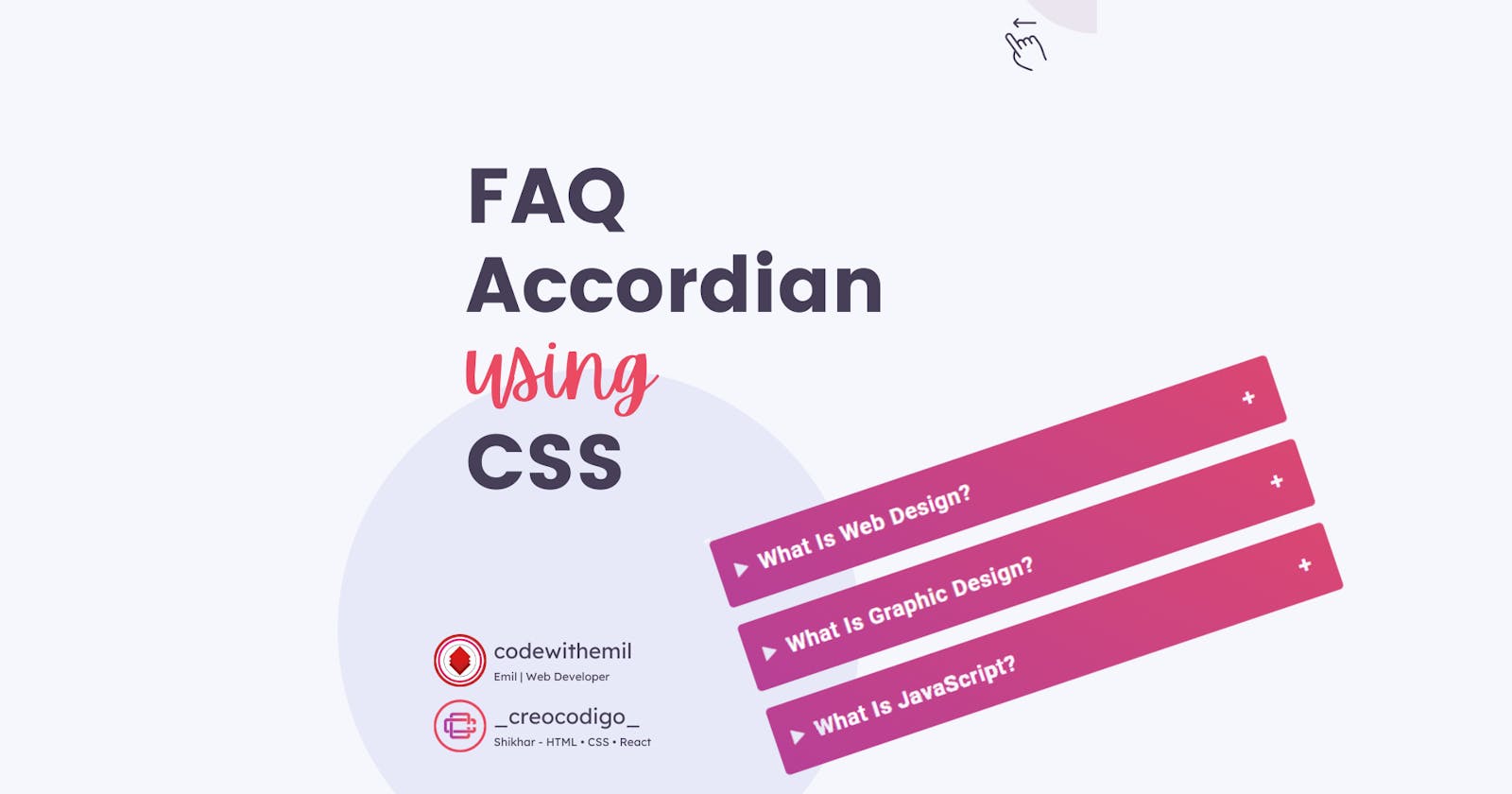
Here's a preview -

That being said, let us get started.
Step - 1: Like always, create 2 files - index.html and style.css.
Step - 2: Copy the below HTML code and paste it into your code editor.
HTML
<!DOCTYPE html>
<html>
<head>
<meta charset="utf-8">
<meta http-equiv="X-UA-Compatible" content="IE=edge,chrome=1">
<meta name="viewport" content="width=device-width, initial-scale=1, shrink-to-fit=no">
  <title>HTML & CSS FAQ Accordion Example</title>
<link rel="stylesheet" href="./style.css">

</head>
<body>
  <h1>FAQ Accordion Example</h1>
  <main>
  <details open>
    <summary>What Is Web Design?</summary>
    <div class="faq__content">
      <p>Web design encompasses many different skills and disciplines in the production and maintenance of websites.</p>
    </div>
  </details>

    <details>
    <summary>What Is Graphic Design?</summary>
    <div class="faq__content">
      <p>Graphic design is the process of visual communication and problem-solving through the use of typography, photography, iconography and illustration. </p>
    </div>
  </details>
  <details>
    <summary>What Is JavaScript?</summary>
    <div class="faq__content">
      <p>JavaScript, often abbreviated as JS, is a programming language that conforms to the ECMAScript specification. </p>
    </div>
  </details>
   </main>

</body>
</html>
Step - 3: Below is the CSS code for styling.
CSS
body {
  font-family: 'Roboto', sans-serif;
  font-size: 16px;
  font-weight: 400;
  background: #f6f7fc;
  color: #463f57;
  line-height: 1.5;
  letter-spacing: 0.5px;
  text-align: center;
  height: 100vh;
}
h1 {
  font-size: clamp(20px, 4vw, 30px);
  line-height: 1.2;
  margin-bottom: 40px;
  margin-top: 150px;
}
main {
  max-width: 520px;
  margin: 0 auto;
}
summary {
  font-size: 1.25rem;
  font-weight: 600;
  background: linear-gradient(45deg, #b74096, #da4772);
  color: #fff;
  padding: 1rem;
  margin-bottom: 1rem;
  outline: none;
  border-radius: 0.25rem;
  text-align: left;
  cursor: pointer;
  position: relative;
}
p { text-align: left; }
details[open] summary ~ * {
  animation: sweep .5s ease-in-out;
}
@keyframes sweep {
  0%    {opacity: 0; margin-top: -10px}
  100%  {opacity: 1; margin-top: 0px}
}
details > summary::after {
  position: absolute;
  content: "+";
  right: 20px;
}
details[open] > summary::after {
  position: absolute;
  content: "-";
  right: 20px;
}
details > summary::-webkit-details-marker {
  display: none;
}
And that's it. You're done.
Let me know in the comments if you have any doubt related to this.
Follow @creocodigo for more projects and web related content.
If you find this useful, below are some other posts that I am sure you'll love.