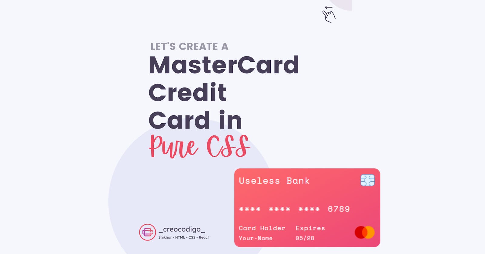
Hello Coders! Welcome to CSS Animation Blog. In this, we are going to see using just some properties of CSS, how we can create the design of a MasterCard credit card. We're going to learn how to position elements inside a particular div. This is gonna help you a lot while creating a website as well.
Here's a preview -

That being said, let us get started.
Step - 1: Like always, create 2 files - index.html and style.css.
Step - 2: Copy the below HTML code and paste it into your code editor.
HTML
<body class="flex-r">
    <div class="card flex-c">
        <div class="card-header flex-r">
            <div>Useless Bank</div>
            <div class="sim-img flex-r">
                <img src="https://img.icons8.com/ultraviolet/40/000000/sim-card-chip.png" alt="">
            </div>
        </div>
        <div class="card-num flex-r">**** **** **** 6789</div>
        <div class="card-footer flex-r">
            <div class="card-info flex-r">
                <div class="card-name flex-c">
                    <span>Card Holder</span>
                    <span>Deepak</span>
                </div>
                <div class="card-date flex-c">
                    <span>Expires</span>
                    <span>05/28</span>
                </div>
            </div>


            <div class="master-img flex-r">
                <img src="https://img.icons8.com/color/48/000000/mastercard-logo.png" alt="">
            </div>
        </div>
    </div>
</body>
Step - 3: Below is the CSS code for styling.
CSS
@import url('https://fonts.googleapis.com/css2?family=Space+Mono&display=swap');

*{
    margin: 0px;
    box-sizing:border-box;
    font-family: 'Space Mono', monospace;
}


.flex-r{
    display: flex;
    justify-content: center;
    align-items: center;
    flex-direction: row;
}

.flex-c{
    display: flex;
    justify-content: center;
    align-items: center;
    flex-direction: column;
}
body{
    background: linear-gradient(to right top, #a2beeb, #8ecfee, #8edde5, #a4e7d5, #c7eec7);
    width: 100%;
    height: 100vh;
}

.card{
    justify-content: space-between;
    align-items: flex-start;
    padding: 10px 12px;
    width: 370px;
    height: 200px;
    border-radius: 15px;
    background-image: linear-gradient(to right bottom, #fd696b, #fa616e, #f65871, #f15075, #ec4879);

}
.card-header{
    width: 100%;
    justify-content: space-between;
    color: white;
    letter-spacing: 1px;
    font-size: 23px;
}


.card-num{
    width: 100%;
    justify-content: flex-start;
    word-spacing: 4px;
    font-size: 20px;
    letter-spacing: 2px;
    color: #fff;
    text-align: center;
    margin: 30px 0px 10px 0px;
}
.card-footer{
    width: 100%;
    color: #fff;
    justify-content: space-between;
}

.card-info div{
    align-items: flex-start;
    font-size: 14px;
    letter-spacing: 1px;
}
.card-info div:nth-child(1){
    margin-right: 25px;
}
.card-info div span:nth-child(1){
    font-size: 16px;
    margin-bottom: 3px;

}

.master-img img{
    width: 55px;
}
And that's it. You're done.
Let me know in the comments if you have any doubt related to this.
Follow @creocodigo for more projects and web related content.
If you find this useful, below are some other posts that I am sure you'll love
