Mobile UI Navbar Animation
Published
•2 min read
Hello Coders! Welcome to CSS Project Blog. In this, we're going to see how to create a Mobile UI Navbar with some animation.
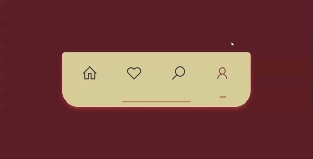
Here's a preview-
That being said, let us get started.
Step - 1: Like always, create 3 files - index.html, style.css and script.js
Step - 2: Copy the below HTML code and paste it into your code editor.
HTML
<!DOCTYPE html>
<html lang="en">

<head>
    <meta charset="UTF-8">
    <meta name="viewport" content="width=device-width, initial-scale=1.0">
    <meta http-equiv="X-UA-Compatible" content="ie=edge">
    <link rel="stylesheet"
        href="https://maxcdn.icons8.com/fonts/line-awesome/1.1/css/line-awesome-font-awesome.min.css">
    <link rel="stylesheet" href="style.css">
    <title>navbar</title>
</head>

<body>
  <div class="navbar">
      <div class="item fa fa-home active active-selector"><a href="#"></a></div>
      <div class="item fa fa-heart-o"><a href="#"></a></div>
      <div class="item fa fa-search"><a href="#"></a></div>
      <div class="item fa fa-user"><a href="#"></a></div>
      <div class="bar"></div>
  </div>
</body>
  <script  src="./script.js"></script>

</body>
</html>
Step - 3: Below is the CSS code for styling.
CSS
body {
  height: 100vh;
  margin: 0;
  padding: 0;
  display: flex;
  justify-content: center;
  align-items: center;
  background-color: #632626;
}
.navbar {
  font-size: 2em;
  display: inherit;
  justify-content: space-evenly;
  align-items: center;
  position: relative;
  display: inherit;
  width: 550px;
  height: 160px;
  background-color: #DACC96;
  border-radius: .5rem .5rem 3rem 3rem;
  box-shadow: 0px 5px 15px -3px #d84c4c;
}
.item {
  font-size: 1.5em;
  padding: .5em;
  margin-bottom: .8em;
  color: #424242;
  border-radius: 2em;
  cursor: pointer;
  transition: all .25s linear;
}
.item:hover {
  color: #9D5353;
  background-color: #fbf0f0;
  transform: scale(1.1);
}
.active {
  position: relative;
  color: #9D5353;
  transition: all .25s linear;
}
.active::after {
  content: '';
  position: absolute;
  bottom: -.5em;
  left: calc(50% - 10px);
  width: 20px;
  height: 5px;
  border-radius: 50px;
  background-color: #BF8B67;
}
.bar {
  position: absolute;
  bottom: .8rem;
  left: calc(50% - 100px);
  width: 200px;
  height: 4px;
  background-color: #BF8B67;
  border-radius: 3em;
}
Step - 3: Below is the jQuery code for adding and removing the class.
JS
const navbar = document.querySelector('.navbar');

navbar.addEventListener('click', (e) => {
    if (!e.target.contains(navbar)) {
        document.querySelector('.active').classList.remove('active');
        e.target.classList.add('active');
    }
});
And that's it. You're done.
Let me know in the comments if you have any doubt related to this.
Follow @creocodigo for more projects and web related content.
If you find this useful, below are some other posts that I am sure you'll love


