

Hello Coders! Welcome to CSS Animation Blog. In this, we're going to see how to create Responsive Pricing Card in pure CSS. Any website, be it SaaS or FaaS or any othe product based website, to show user how much your service charge or how much is your product is the most important aspect of the website. User must be able to see and clearly understand various services you are offering and at the same time , they will be able to compare between various prices. Hence an attempt of mine in creating this pricing card.
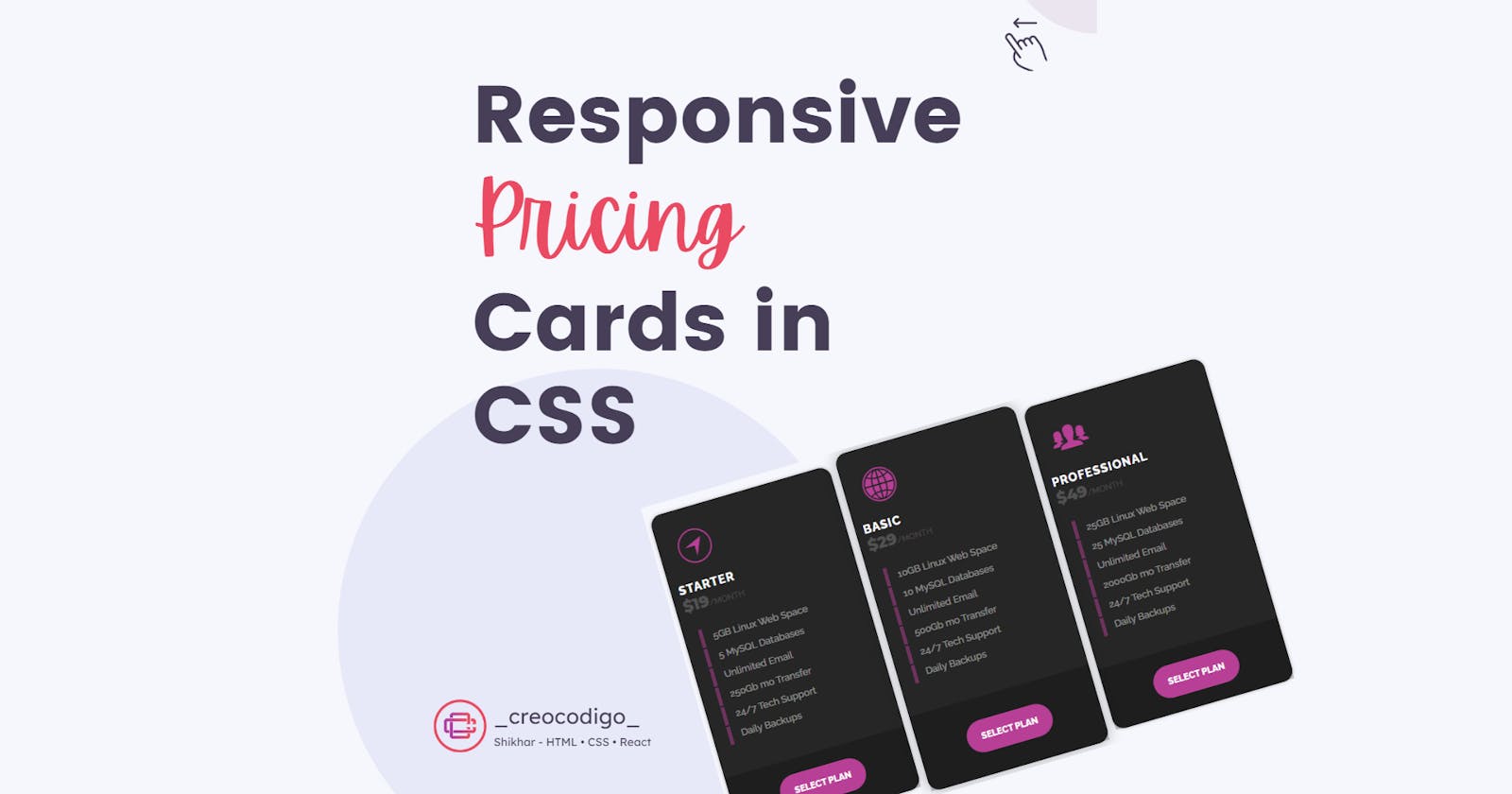
Here's a preview -

That being said, let us get started.
Step - 1: Like always, create 2 files - index.html and style.css.
Step - 2: Copy the below HTML code and paste it into your code editor.
HTML
<!DOCTYPE html>
<html lang="en" >
<head>
  <meta charset="UTF-8">
  <title>Pricing table</title>
  <link rel='stylesheet' href='https://www.littlesnippets.net/css/codepen-result.css'><link rel="stylesheet" href="./style.css">

</head>
<body>

<div class="card">
  <div class="plan">
    <header><i class="ion-ios-navigate-outline"></i>
      <h4 class="plan-title">
        Starter
      </h4>
      <div class="plan-cost"><span class="plan-price">$19</span><span class="plan-type">/month</span></div>
    </header>
    <ul class="plan-features">
      <li>5GB Linux Web Space
      </li>
      <li>5 MySQL Databases
      </li>
      <li>Unlimited Email
      </li>
      <li>250Gb mo Transfer
      </li>
      <li>24/7 Tech Support
      </li>
      <li>Daily Backups
      </li>
    </ul>
    <div class="plan-select"><a href="">Select Plan</a></div>
  </div>
  <div class="plan featured">
    <header><i class="ion-ios-world"></i>
      <h4 class="plan-title">
        Basic
      </h4>
      <div class="plan-cost"><span class="plan-price">$29</span><span class="plan-type">/month</span></div>
    </header>
    <ul class="plan-features">
      <li>10GB Linux Web Space
      </li>
      <li>10 MySQL Databases
      </li>
      <li>Unlimited Email
      </li>
      <li>500Gb mo Transfer
      </li>
      <li>24/7 Tech Support
      </li>
      <li>Daily Backups
      </li>
    </ul>
    <div class="plan-select"><a href="">Select Plan</a></div>
  </div>
  <div class="plan">
    <header><i class="ion-ios-people"></i>
      <h4 class="plan-title">
        Professional
      </h4>
      <div class="plan-cost"><span class="plan-price">$49</span><span class="plan-type">/month</span></div>
    </header>
    <ul class="plan-features">
      <li>25GB Linux Web Space
      </li>
      <li>25 MySQL Databases
      </li>
      <li>Unlimited Email
      </li>
      <li>2000Gb mo Transfer
      </li>
      <li>24/7 Tech Support
      </li>
      <li>Daily Backups
      </li>
    </ul>
    <div class="plan-select"><a href="">Select Plan</a></div>
  </div>
</div>


</body>
</html>
Step - 3: Below is the CSS code for styling.
CSS
@import url(https://code.ionicframework.com/ionicons/2.0.1/css/ionicons.min.css);
@import url(https://fonts.googleapis.com/css?family=Raleway:400,500,800);
@import url(https://fonts.googleapis.com/css?family=Montserrat:800);
body{
  background: #f6f7fc;
  display: flex;
  justify-content: center;
  align-items: center;
}
.card {
  font-family: 'Raleway', Arial, sans-serif;
  color: #ffffff;
  text-align: left;
  font-size: 16px;
  width: 100%;
  max-width: 1000px;
  margin: 50px 10px 10px;
  padding-left: 200px;
}
.card .plan {
  margin: 0;
  width: 25%;
  position: relative;
  float: left;
  background-color: #262626;
  border: 1px solid #1e1e1e;
  box-shadow: 0 0 5px rgba(0, 0, 0, 0.25);
  margin-left: 10px;
  border-radius: 15px;
}
.card .plan:hover,
.card .plan.hover {
  background-color: #1c1c1c;
}
.card .plan:hover i,
.card .plan.hover i {
  transform: scale(1.2);
}
.card * {
  box-sizing: border-box;
  transition: all 0.25s ease-out;
}
.card header {
  position: relative;
  padding: 20px 10px;
}
.card header i {
  font-size: 56px;
  margin: 0 15px;
  color: #b74096;
  display: inline-block;
}
.card .plan-title {
  top: 0;
  font-weight: 800;
  margin: 10px 0 0;
  text-transform: uppercase;
  letter-spacing: 1px;
}
.card .plan-cost {
  margin: 0;
  opacity: 0.2;
}
.card .plan-price {
  font-family: 'Montserrat', Arial, sans-serif;
  font-weight: 800;
  font-size: 1.3em;
}
.card .plan-type {
  opacity: 0.8;
  font-size: 0.7em;
  text-transform: uppercase;
}
.card .plan-features {
  padding: 0;
  margin: 0 0 40px;
  text-align: center;
  list-style: outside none none;
  font-size: 0.8em;
  text-align: left;
}
.card .plan-features li {
  padding: 5px 5%;
  font-weight: 500;
  opacity: 0.5;
  border-left: 5px solid #b74096;
  margin: 2px 20px;
}
.card .plan-select {
  background-color: rgba(0, 0, 0, 0.2);
  text-align: center;
}
.card .plan-select a {
  color: #ffffff;
  text-decoration: none;
  padding: 15px 20px;
  margin: 20px;
  border-radius: 40px;
  font-size: 0.75em;
  font-weight: 800;
  text-transform: uppercase;
  display: inline-block;
  background-color: #b74096;
}
.card .plan-select a:hover {
  background-color: #262626;
}
.card .featured {
  margin-top: -10px;
  background-color: #262626;
  box-shadow: 0 0 20px rgba(0, 0, 0, 0.3);
  z-index: 1;
}
.card .featured .plan-select a {
  margin: 30px 20px;
}
@media only screen and (max-width: 767px) {
  .card .plan {
    width: 50%;
  }
  .card .plan-title,
  .card .plan-select a {
    -webkit-transform: translateY(0);
    transform: translateY(0);
  }
  .card .plan-select a,
  .card .featured .plan-select a {
    margin: 20px;
  }
  .card .featured {
    margin-top: 0;
  }
}
@media only screen and (max-width: 440px) {
  .card .plan {
    width: 100%;
  }
}
And that's it. You're done.
Let me know in the comments if you have any doubt related to this.
Follow @creocodigo for more projects and web related content.
If you find this useful, below are some other posts that I am sure you'll love