

Hello Coders! Welcome to Creo-Codigo. A place for all your web development needs.
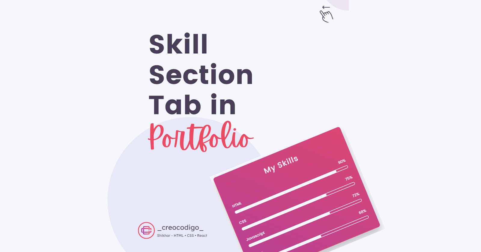
Today, we're going to see how to create an Animated Skill Section for your Portfolio. Skill section is very important for any portfolio website because it showcases your skills and talents. It specifies how much you know your technologies and others as well. Basically, this can be achieved easily using plugins but in this we're going to create this using Pure HTML and CSS. So let's go.
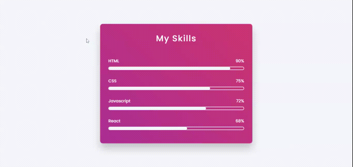
Here's a preview -
That being said, let us get started.
Step - 1: Like always, create 3 files - index.html, style.css and script.js.
Step - 2: Copy the below HTML code and paste it into your code editor.
HTML
<!DOCTYPE html>
<html lang="en" >
<head>
  <meta charset="UTF-8">
  <title>Skills Section</title>
<link rel="stylesheet" href="./style.css">
<script src="https://cdnjs.cloudflare.com/ajax/libs/prefixfree/1.0.7/prefixfree.min.js"></script>

</head>
<body>

<div class="wrapper">
        <div class="shape-1"></div>
        <div class="shape-2"></div>
        <div class="container">
            <h2>My Skills </h2>
            <div class="skills">
                <div class="details">
                    <span>HTML</span><span>90%</span>
                </div>
                <div class="bar">
                    <div id="html-bar"></div>
                </div>
            </div>
            <div class="skills">
                <div class="details">
                    <span>CSS</span><span>75%</span>
                </div>
                <div class="bar">
                    <div id="css-bar"></div>
                </div>
            </div>
            <div class="skills">
                <div class="details">
                    <span>Javascript</span><span>72%</span>
                </div>
                <div class="bar">
                    <div id="js-bar"></div>
                </div>
            </div>
            <div class="skills">
                <div class="details">
                    <span>React</span><span>68%</span>
                </div>
                <div class="bar">
                    <div id="react-bar"></div>
                </div>
            </div>
        </div>
    </div>

</body>
</html>
Step - 3: Below is the CSS code for styling.
CSS
*{
    padding: 0;
    margin: 0;
    box-sizing: border-box;
}
body{
  height:100vh;
    background-color: #f6f7fc;
}
.wrapper{
    width: 40%;
    min-width: 590px;
    position: absolute;
    transform: translate(-50%,-50%);
    left: 50%;
    top: 50%;
}
.container{
    width: 100%;
    padding: 30px 30px 50px;
    background: linear-gradient(45deg, #b74096, #da4772);
    border: 2px solid rgba(255,255,255,0.06);
    border-radius: 10px;
    box-shadow: 0 20px 30px rgba(0,0,0,0.2);
    backdrop-filter: blur(10px);
}
.container *{
    font-family: "Poppins",sans-serif;
    color: white;
    font-weight: 500;
}
h2{
    margin-bottom: 50px;
    letter-spacing: 2px;
    text-align: center;
    font-size: 33px;
    font-weight: bold;
}
.skills:not(:last-child){
    margin-bottom: 30px;
}
.details{
    width: 100%;
    display: flex;
    justify-content: space-between;
    margin-bottom: 10px;
}
.bar{
    position: relative;

    border: 2px solid #f6f7fc;

    border-radius: 20px;

}
.bar div{
    position: relative;
    width: 0;
    height: 9px;
    border-radius: 10px;
    background-color: #f6f7fc;


}
Now after styling, we have to give the bar a progressive animation. So below is the code for that written in CSS.
Animation of the Bar
#html-bar{
    animation: html-fill 2s forwards;
}
@keyframes html-fill{
    100%{
        width: 90%;
    }
}
#css-bar{
    animation: css-fill 2s forwards;
}
@keyframes css-fill{
    100%{
        width: 75%;
    }
}
#js-bar{
    animation: js-fill 2s forwards;
}
@keyframes js-fill {
    100%{
        width: 72%;
    }
}
#react-bar{
    animation: react-fill 2s forwards;
}
@keyframes react-fill{
    100%{
        width: 58%;
    }
}
And that's it. You're done.
Let me know in the comments if you have any doubt related to this.
Follow @creocodigo for more projects and web related content.
If you find this useful, below are some other posts that I am sure you'll love.