Circular Skills Progress Bar in Pure CSS

Hello Coders! Welcome to CSS Animation Blog. In this, let's create a Circular Progress Bar for Skill Section. This was asked by an Instagram Friend, so I thought let's give it a try. Few months back I created a Skill Progress Bar which was linear. This is the 2nd version of it where you can see the progress bar animation but in a radial fashion. You can add this in your portfolio websites.
Skills Progress Bar Article - Here
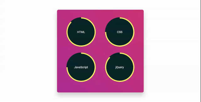
Here's a preview -
That being said, let us get started.
Step - 1: Like always, create 2 files - index.html and style.css.
Step - 2: Copy the below HTML code and paste it into your code editor.
HTML
<html lang="en">
<head>
  <meta charset="UTF-8">
  <meta http-equiv="X-UA-Compatible" content="IE=edge">
  <meta name="viewport" content="width=device-width, initial-scale=1.0">
  <link rel="stylesheet" href="style.css">
  <title>Circular Skill Bar</title>
</head>
<body>
  <div class="wrapper">
    <div class="container">

          <div class="progress">
              <span class="title timer">HTML</span>
              <div class="overlay"></div>
              <div class="left"></div>
              <div class="right"></div>
          </div>
          <div class="progress">
              <span class="title timer">CSS</span>
              <div class="overlay"></div>
              <div class="left"></div>
              <div class="right"></div>
          </div>

          <div class="progress">
              <span class="title timer" >JavaScript</span>
              <div class="overlay"></div>
              <div class="left"></div>
              <div class="right"></div>
          </div>

          <div class="progress">
              <span class="title timer">jQuery</span>
              <div class="overlay"></div>
              <div class="left"></div>
              <div class="right"></div>
          </div>
      </div>
  </div>
</body>
</html>
Step - 3: Below is the CSS code for styling.
CSS
@import url("https://fonts.googleapis.com/css2?family=Roboto&display=swap");

* {
  box-sizing: border-box;
  padding: 0;
  margin: 0;
}

body{
  background: #f6f7fc;
}

.wrapper {
  width: 40%;
  min-width: 590px;
  position: absolute;
  transform: translate(-50%, -50%);
  left: 50%;
  top: 50%;
}
.container {
  display: flex;
  justify-content: space-around;
  flex-wrap: wrap;
  padding: 30px 30px 50px;
  background: linear-gradient(45deg, #b74096, #da4772);
  border: 2px solid rgba(255, 255, 255, 0.06);
  border-radius: 10px;
  box-shadow: 0 20px 30px rgba(0, 0, 0, 0.2);
  backdrop-filter: blur(10px);
}
h2 {
  margin-bottom: 50px;
  letter-spacing: 2px;
  text-align: center;
  font-size: 33px;
  font-weight: bold;
}
.progress {
  width: 200px;
  height: 200px;
  font-size: 20px;
  color: #f6f7fc;
  border-radius: 50%;
  overflow: hidden;
  position: relative;
  background: #072227;
  text-align: center;
  line-height: 200px;
  margin: 20px;
  font-family: "Roboto", sans-serif;
}
.progress .title {
  position: relative;
  z-index: 100;
}
.progress .overlay {
  width: 50%;
  height: 100%;
  position: absolute;
  top: 0;
  left: 0;
  z-index: 1;
  background-color: #072227
}
.progress .left,
.progress .right {
  width: 50%;
  height: 100%;
  position: absolute;
  top: 0;
  left: 0;
  border: 8px solid #FFE162;
  border-radius: 100px 0px 0px 100px;
  border-right: 0;
  transform-origin: right;
}
.progress .left {
  animation: load1 1s linear forwards;
}
.progress:nth-of-type(2) .right,
.progress:nth-of-type(3) .right {
  animation: load2 .5s linear forwards 1s;
}
.progress:last-of-type .right,
.progress:first-of-type .right {
  animation: load3 .8s linear forwards 1s;
}
@keyframes load1 {
  0% {
    transform: rotate(0deg);
  }

  100% {
    transform: rotate(180deg);
  }
}

@keyframes load2 {
  0% {
    z-index: 100;
    transform: rotate(180deg);
  }

  100% {
    z-index: 100;
    transform: rotate(270deg);
  }
}

@keyframes load3 {
  0% {
    z-index: 100;
    transform: rotate(180deg);
  }

  100% {
    z-index: 100;
    transform: rotate(315deg);
  }
}
And that's it. You're done.
Let me know in the comments if you have any doubt related to this.
Follow @creocodigo for more projects and web related content.
If you find this useful, below are some other posts that I am sure you'll love


